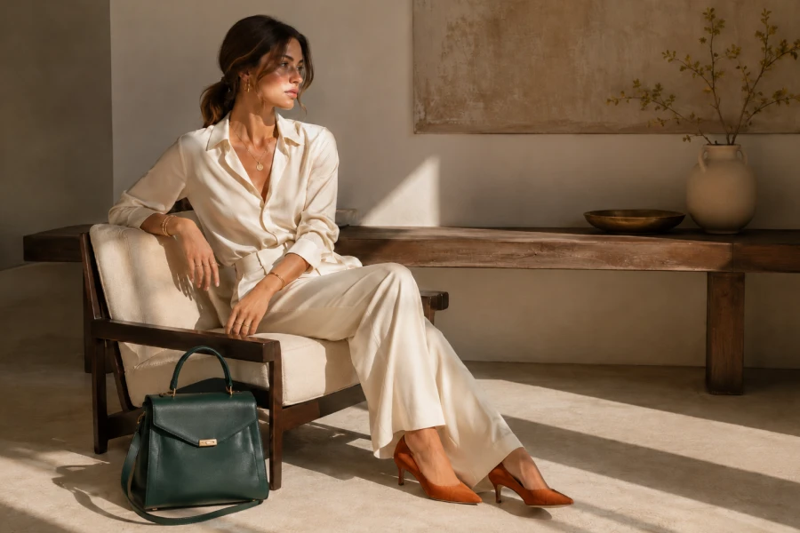
Color can make an accessory feel artistic, polished, playful, or powerful. Bold accessory color combinations work best when they are chosen with intention instead of added at random. The right relationship between clothing and accessories can make a simple outfit feel newly alive. You do not need to wear many bright shades at once to create impact. One vivid bag, shoe, earring, or belt may be enough. The key is understanding whether you want harmony, contrast, or a small unexpected twist. Start by looking at the colors you already wear often. Then add accessories that either deepen those shades or create an intentional counterpoint. With practice, color becomes a way to express mood without making an outfit feel complicated.
Neutrals offer an easy backdrop for expressive color because they provide visual space. Black, cream, navy, denim, charcoal, and soft brown all support stronger accessories. Start with an outfit that already feels good in silhouette and proportion. Then choose one color that changes its energy. A red bag can warm up navy tailoring. Green earrings can make a cream knit feel fresher. A collection of colorful accessory pairings becomes easier to use when the clothing base remains simple. This does not mean every outfit must be neutral. It simply gives you a reliable place to start. Stable foundations make color feel deliberate instead of accidental. They also make experimentation feel less intimidating.
Color harmony creates a connected look by using shades that feel naturally related. Blue accessories with navy, green accents with olive, or burgundy details with warm brown can feel rich and calm. Contrast creates more visual energy by placing different colors beside each other. A bright orange bag with cobalt denim can feel lively and modern. Neither approach is automatically better. The choice depends on your mood, setting, and personal comfort. Begin with colors that already appear somewhere in your wardrobe. Then explore one unexpected partner when you feel ready. Consider the intensity as well as the hue. A soft pastel can create contrast without becoming overwhelming. Balanced color starts with observation, not strict rules.
When several colors appear in one look, choose a hero shade that leads the conversation. This keeps the outfit from feeling scattered. The hero may come from a bag, shoe, scarf, or piece of jewelry. Let supporting colors appear in smaller amounts or quieter tones. A vivid shoe can pair beautifully with a neutral bag and simple jewelry. A colorful earring can work with one soft echoed detail elsewhere. Use personal style accessories to test which colors feel most connected to your identity. You may discover that one shade consistently makes you feel energized. That color can become a useful signature. A clear hero shade gives the whole outfit a more confident visual center.
Texture changes the way color appears and can make a vivid accessory feel more sophisticated. Suede often softens bright shades, while glossy leather makes them appear sharper. Woven materials can add warmth and visual depth. Metal finishes may introduce color through reflection rather than pigment. Consider the season and fabric weight when choosing the texture. A bright suede shoe may feel perfect with autumn knits. A polished colored bag may suit sleek summer clothing. Texture also creates contrast when the colors remain close. A matte outfit can support a glossy accessory beautifully. This layer of thinking makes color styling feel more nuanced. It allows you to create impact without relying on brightness alone.
Some color choices feel casual in daylight yet striking enough for evening plans. A deep jewel-toned bag, metallic shoe, or saturated earring can make that transition easily. Keep day-to-night accessories in colors that feel versatile across different lighting. Deep green, cobalt, burgundy, and warm metallic tones often work especially well. Pair them with straightforward clothing so the accessory can change the mood later. A blazer may come off, a shoe may change, or one additional earring can be added. That flexibility makes color feel practical rather than precious. It also gives you more value from a smaller collection. The right shade can carry an outfit through more than one version of the day.
Color is most powerful when it has enough room to register. If an outfit starts to feel busy, remove one competing detail. You may not need the colorful bag, shoe, and necklace together. Try keeping the strongest piece and simplifying the rest. This edit does not reduce creativity. It gives your best choice more space to work. Look at the outfit in natural light before leaving. Take a quick photo if you are unsure about the balance. Images can reveal whether colors feel cohesive from a distance. Editing becomes easier when you recognize that restraint can be expressive too. A quiet supporting piece may be exactly what makes the bolder color look intentional.
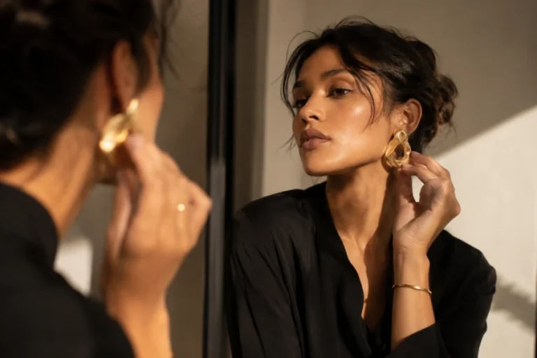
Color confidence develops when you repeat choices that make you feel good. Start by wearing one strong shade with familiar clothing. Then explore a new color relationship once that combination feels comfortable. The right accessory can create bold jewelry confidence even when the rest of your outfit remains simple. Pay attention to which colors earn compliments and which ones improve your mood. Those reactions are useful clues, not rigid instructions. Over time, you will develop a palette that feels personal and easy to use. It may include one signature color or several rotating accents. What matters is that the combinations feel like your own. Repetition turns color from a styling risk into a natural part of your visual language.


Leave a comment